

Positioning a developer-first product for enterprise scale.



Overview
When we met, Coder was already trusted by some of the world’s most advanced product teams. What started as a secure cloud development environment was becoming a broader toolset, designed for engineers and AI agents to work together more efficiently.
With this expansion came new expectations. Conversations were reaching deeper into the enterprise. Product stories were getting more layered. And the need for credibility, clarity, and control was more urgent than ever.
We partnered to reposition the Coder brand, build a narrative that would support their growth, and create a website capable of helping their team sell, scale, and tell a bigger story.
Our Role
Product positioning across CDE and AI
Messaging for developers and enterprise buyers
Visual identity with built-in flexibility
Website built for technical and business conversion
Enterprise-focused UI and content
Modular CMS with reusable components
Design handoff and dev guidance
Context
AI & ML
coder.comSince Launch


A narrative that meets the moment.
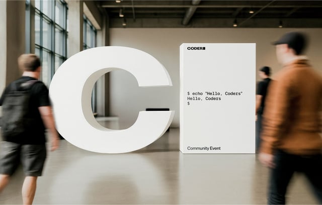
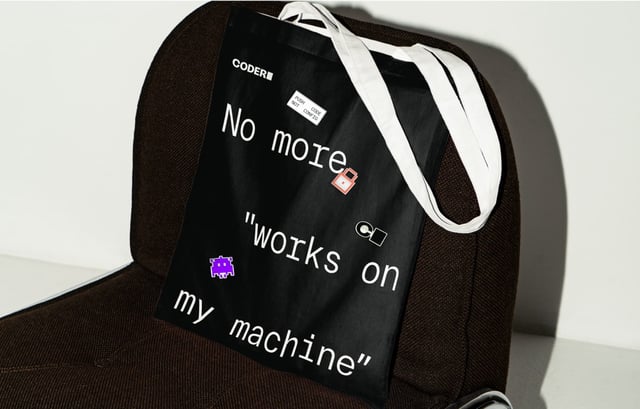
We built a strategic story shaped around a central brand idea: open to build. It captured where the industry is heading and Coder’s role in driving that shift, from today’s secure cloud development environments to a future where developers and AI agents work side by side. The narrative gave the team a clearer way to talk about value, momentum, and change. It reframed software development as more open, collaborative, and accessible, without compromising on control.


“Coder needed to speak to developers, reassure enterprise teams, and still feel open enough for people with no coding experience. Blink gave us a way to tie all of that together.”


Shifting from tool to platform.
We positioned Coder as infrastructure, not just tooling. The narrative moved beyond writing code to enabling better ways of working across teams. This wasn’t about beating competitors. It was about offering a faster, more secure, and more open alternative to legacy development workflows.
Credibility with buyers, relevance for teams.
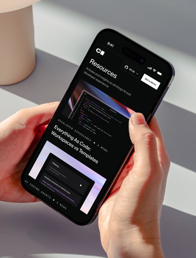
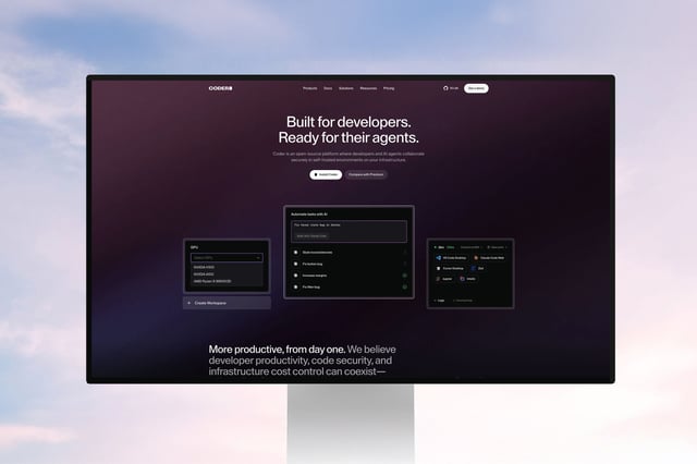
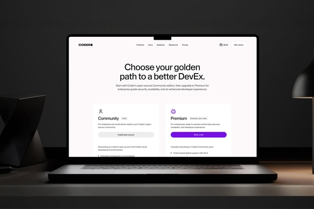
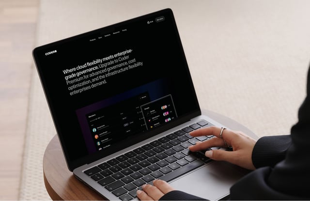
Coder’s audience spans developers, security leads, and senior decision-makers — each with different priorities and levels of technical fluency. We built a messaging system that could stretch across that spectrum without losing coherence. It led with clarity, introduced depth where needed, and supported more structured sales conversations across the buying group. That thinking extended into the website, which was shaped to help technical users find immediate value while giving senior stakeholders a clearer way to understand the product’s impact.
Supporting real sales conversations.
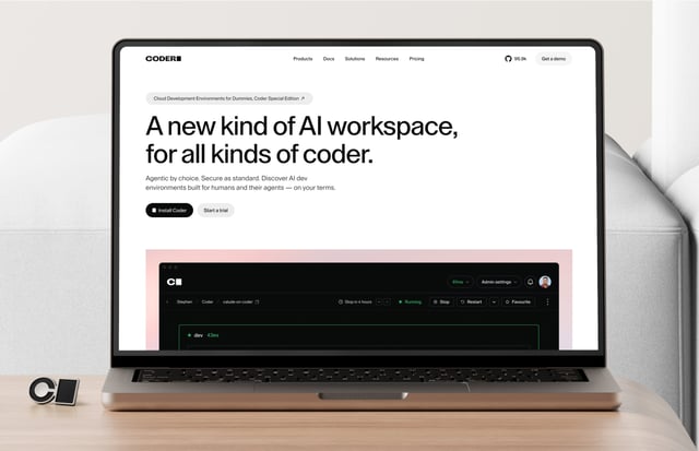
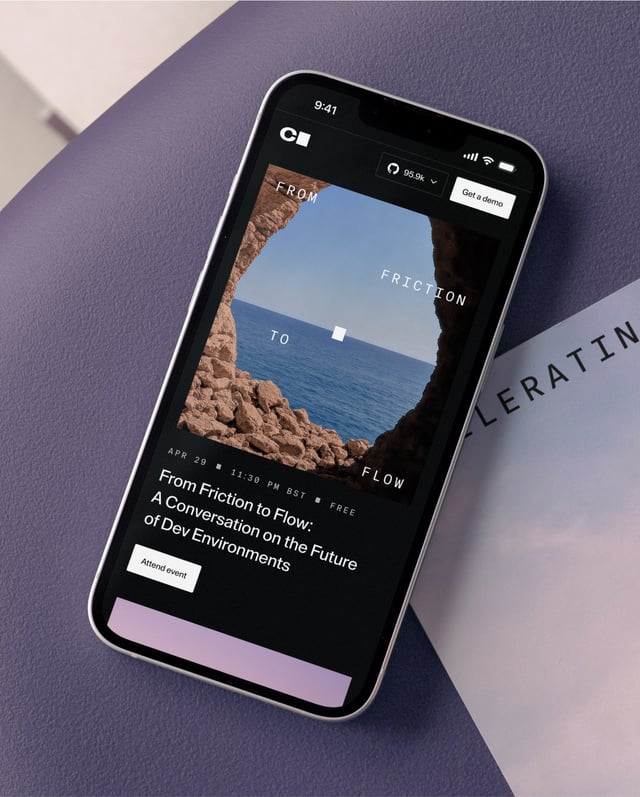
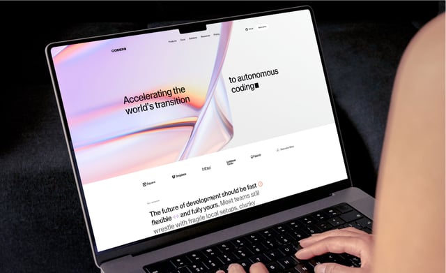
Coder.com was designed to be a high-performing GTM asset. It leads with developer clarity, supports enterprise sales, and tells a fuller product story. The UX helps convert interest across audiences, while the content gives the team a stronger tool for lead gen, alignment, and education.

A system designed for speed.
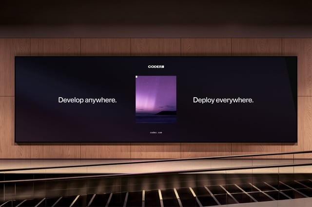
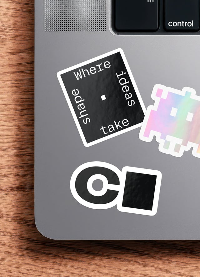
Coder’s design system is intended to be as practical as it is expressive. Easy to use, extend, and maintain across touch-points. It gave internal teams the tools to move faster day to day, while keeping the brand coherent as the company grows.





With Thanks To
Rob Whiteley, Kyle Carberry, Elle Woulfe, Matt Vollmer, Kelsey Dannels, Cassandra Jowett, Rachel Mullenax, Andrew Aquino and the team at Coder.
Next Case Study
Becoming the data infrastructure banks build on.