

Repositioning a payments infrastructure partner from the ground up.
Overview
The future of payments is being rewritten in real time. But the data behind those payments hasn’t kept up. Banks, fintechs and platforms process billions in transactions every day but still struggle with incomplete, inconsistent, and unreliable merchant data.
Spade was built to solve this. Their real-time enrichment API transforms raw payment data into precise, auditable intelligence. But the brand didn’t reflect the depth of the data uncovered or the scale of enterprise use cases it powered.
The old positioning was anchored in transaction enrichment, a term weighed down by industry scepticism. The website undersold Spade’s accuracy, speed, and breadth, and didn’t reflect its role as foundational infrastructure partner for authorisation, attribution, analytics, and AI.
We partnered with Spade to elevate the brand, sharpen their story, and build a digital presence worthy of the product: precise, confident, and enterprise-ready.
Our Role
Positioning
Brand Strategy
Visual Identity
Verbal Identity
Architecture
Website Design
Copywriting
Development
Context
Fintech
spade.comSince Launch



A category-defining position built on ground truth.
The enrichment category is crowded and clouded by distrust. Banks want auditability. Fintechs want reliability. Everyone wants real-time. But many vendors still rely on opaque models or fragile heuristics.
Spade’s advantage was clear: unmatched accuracy rooted in a proprietary merchant network covering 99.9% of US merchants, delivered in under 50ms response times.
We repositioned Spade around a single conviction: The future of money should be built on ground truth data.
This elevated Spade above point-solution competitors and reframed the brand as an enterprise-grade infrastructure partner. Not a utility or widget, but a critical layer powering authorisation, attribution, AI, and customer experience.
The new market position is broader, clearer, and more ambitious, giving Spade room to grow into emerging opportunities across data, intelligence, and agentic commerce.


A narrative that elevates enrichment into intelligence.
Raw data isn’t the story. What enterprises need is meaning: merchant identity, category clarity, geolocation, attributes, and context that unlocks real decision-making.
We transformed Spade’s narrative from cleaning transactions to revealing the full story behind every payment.
We built a story rooted in Spade’s experience principles — Embedded, Precise, Rich, Instant, Forward-looking — ensuring every word felt sharp, confident, and grounded in truth.
The result: a narrative that resonates with technical teams and enterprise buyers alike, bridging the gap between data infrastructure and commercial outcomes.




A scalable identity for a fast-moving product and team.
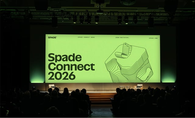
The old identity didn’t reflect Spade’s ambition or technical depth. We rebuilt the visual system to embody the new brand. Tactile, grounded, and unmistakably Spade.
Everything is built to move fast: from modular components to a CMS system that empowers Spade’s team to launch quickly and consistently.



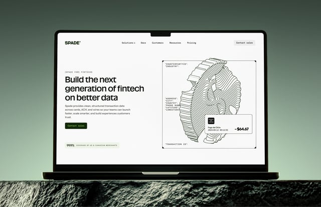
A website engineered for trust, clarity, and conversion.
Spade’s audiences (banks, fintechs, and resellers) each arrive with different expectations, challenges, and internal constraints. We redesigned the website to serve all of them.
Every page from Authorisation to Analytics to Ecosystem Partners is designed to show how Spade’s intelligence improves decisions, reduces fraud, deepens insights, and powers better money experiences.
Motion, framing, and data-led visuals bring the product to life, mirroring the immediacy and clarity of the API itself.


With Thanks To
Oban MacTavish, Lauren Crossett, Hailey McCracken and the team at Spade.
Next Case Study
Becoming an AI operating system for revenue.