


Repositioning the world’s favourite design system platform.


Overview
zeroheight helps product teams manage their design systems, bringing together documentation, analytics and governance in one place. As the company grew, it needed to move from “documentation tool” to something bigger: design system management.
Our collaboration focused on that shift in positioning. We refined the story, structured the website around clear product pillars, and designed an experience that makes zeroheight’s possibilities obvious. All while supporting both self-serve teams and enterprise.
Today, zeroheight is recognised as the leading design system management platform globally — trusted by ambitious product teams around the world, backed by a strong track record of enterprise adoption, and with a significant community influence.
Our Role
Positioning
Architecture
Website Design
Copywriting
Development
Context
Sales & Marketing
zeroheight.com
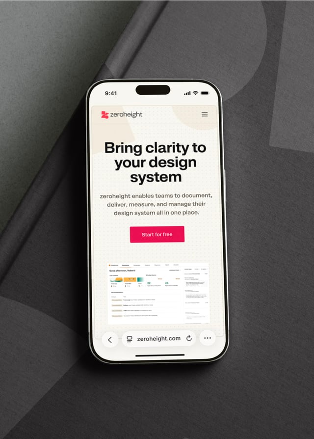
Less tool, more platform. Clarifying the category.
Historically perceived as a documentation tool, zeroheight had bigger ambitions. The opportunity centred on “design system management” — a category of its own. We built the site around a simple model of Document, Deliver, Measure, Manage, making additional features a core part of a new, platform-focused story.
Presenting the possibilities through digital experience.
As with zeroheight’s positioning and messaging strategy, the previous marketing site didn’t show the full scope of the product. Visitors left without understanding how it handled analytics, permissions or integrations. We made this comprehensiveness the centre of the story, with clear architecture, product packaging, UI storytelling and motion that make all possibilities visible.




Two clear buyer journeys.
The old website blurred the path between self-serve and enterprise buyers, creating confusion and wasted effort. We designed two distinct journeys and CTA strategies: Start for free for teams, and Request a demo for larger organisations. Both are supported by transparent pricing and proof points that make the next step obvious.
Helping champions win support.
Most buyers discover zeroheight through a champion (a designer, for instance) who then makes the case internally. To support them, we built proof into the experience with case studies, testimonials, and performance outcomes — giving champions the evidence and language they need to win support and secure renewals.


Fast, modern, maintainable.
The old WordPress site was slow, clunky, and hard to manage. It undercut the credibility of a design tooling company with serious ambitions. We rebuilt the experience on a modern, lightweight stack, designed for speed, elegance, and ease of maintenance. The new site now reflects the quality of the product.


With Thanks To
Jerome de Lafargue, Liam Thomson, Luke Murphy and the team at zeroheight.
Next Case Study
Growing into a full B2B payment system.